skip to main |
skip to sidebar
Today, something significant happened in the gold market.... and it's not good news for the bulls, at least short term.
The current weekly (intermediate) cycle began on September 26th with a low price of $1535 became a left translated weekly cycle on December 22 when the count of days within the weekly cycle reached 63. The cycle's high of November 8th (Day 31) then became left of the cycle's center.
But as I recently pointed out in Gold's Secular Bull Cycles and Its ABCD Pattern, each and every C-wave top has been followed by a left translated weekly cycle except the 2002 C-wave. The odds therefore were very high that our current weekly cycle, which has followed the $1923.7 C-wave top of September 6th, would also be left translated.
However, the left translated cycles that have followed all but one C-wave, curiously, were not failed cycles - except for the early 2004 and 2008 C-waves. A failed weekly cycle is one in which the cycle bottoms lower than the price where it began.
Here is a daily chart of the 2003 - 2006 cycle data for gold.
The early 2004 C-wave was followed by a weekly cycle that was a failed weekly cycle. When a cycle fails price will continue to fall sharply and when it finally bottoms, the A-wave begins with a very powerful rally.
Here, let's take a closer look at the early 2004 example to see the failed weekly cycle in more detail.
In this case, the weekly cycle bottomed 7 or 8 days after the failure.
In 2008, gold investors were not so fortunate to simply endure a week or two for things to start getting better.
In this case, price sliced right through the failure line and kept going, only to decide to retest that price level (unsuccessfully) and then take everyone on a fantastic ride into outer space..... crashing for one week and soaring for the next..... seemingly over and over again.
Last summer I wrote about a post titled, Gold C-wave Tops and D-wave Retracements. My research detailed each of the 6 historic examples with measurements of D-wave price retracement of the C-wave that preceded it, trading day tally for each D-wave, and the relative speed in terms of trading days that each D-wave plummeted to reach key Fibonacci levels.
With today's breach of the current weekly cycle perhaps this would be an opportune time to refresh our memories on the kind of damage D-waves do to the price of gold.
The following chart shows the entire 2009 - 2011 C-wave that concluded September 6th and applies some Fibonacci measurements to this C-wave's $1058.7 rise above its $865 beginning.
It is a bit scary to see the historic retracements of the previous 6 D-waves and apply them to today's situation. We have a retracement to date of 38%. I would put the odds that gold has finished falling at about ZERO. And I would put the odds that gold reaches $1400 at 80 - 95%.
Some readers have been writing to inquire about my work on the four hour cycle of gold - and what it is telling us now, if anything. The following chart jumps us in a new direction with an overview of the past 180 trading days that www.thinkorswim.com platform makes available for the 4 hour time setting.
For starters, the blue counts are the bar lengths of each four hour cycle. These measurements have ranged from 57, 55 and 50 on the long side to 28, 31 and 36 on the short side.
The purple counts are a calculation of the number of trading days in each daily cycle at its concludion. These daily cycles have ranged from 14 to 28 days. My own research on the entire lot of daily cycles from 2001 to present is that daily cycles average 24 days.
The next chart zooms down the time frame to just the current weekly cycle.
Some quick things to note. There have been 3 completed daily cycles in this weekly cycle (18.8, 23 and 27.3 days each). Within each daily cycle we find the nested four hour cycles. The first two daily cycles had three nested four hour cycles. The third daily cycle had four. We have just begun a new daily cycle - literally at 8:00 am cst this morning. And that means we will have more nested four hour cycles before the conclusion of this daily and weekly cycle.
If you would like to study the number of four hour cycles that are nested within each daily cycle just look at the chart that preceded this one!
Well, getting down to the nitty-gritty now. Here is a chart of the four hour cycles up close with the TSI BUY/SELL signals below price.
We see that price has bounced after crashing through the failed cycle level of $1535 (as in the 2004 example), the slower trending TSI (25,25) has turned from red to green, indicating a likely change in trend direction, and the TSI (7,4) has signaled a trend line break BUY (green dot).
BTW, the small red/green dots above price locate the four hour cycle high - red is for left translated, green for right translated.
OK - so where do we go from here?
Lower, obviously. But maybe enough of a bounce in the very short term that I can keep a sale of my NUGT and AGQ positions from being too embarrassing. (lol)
If that does not work out for me I will stand aside and look the other way for awhile. It's a bull market, after all! Those of you who can wait - you are about the get the buy of a lifetime. Let's all keep an eye on it together, OK?
John
tsiTrader@gmail.com
I keep forgetting to update my purchase of AGQ (Silver Bull 2X ETF) on the open this past Monday morning at $46.72. Sorry about that.
My TSI Trading Record has been updated.
I anticipate purchasing shares of Cardero Resources (CDY) when post-Christmas NYSE trade resumes on Tuesday.
Mining stocks, as you are well aware, are very out of favor right now. Indeed, the $BPGDM (Bullish Percent Gold Miners Index) that is available for examination at www.stockcharts.com is at lows that should be close to a bottom. At present it is reading just 13.79 - which is the percentage of mining stocks in the index with BUY signals on their point and figure charts.
Unfortunately, it's entirely possible that miners have not finished their wash out process - particularly as gold itself may have a final leg down to conclude this weekly cycle.
So, with a bit of caution in mind I decided to look at miners that looked as though they were not likely to have much, if any, downside left. While looking at over 200 charts I rediscovered an old friend - a company I have followed for a couple years now, know something about and have traded very successfully in the past. And that company is Cardero Resources (CDY).
Cardero trades on the AMEX exchange. Of all the charts I looked at, Cardero is currently priced closer its 2008 low than any other mining company one could take seriously. Additionally, of all the mining stocks on the AMEX, CDY trades at the lowest price to book value ratio of any - an incredible 57% of book value. Now that is a discount if I ever saw one.
CDY has a small float of just 91M shares outstanding - this figure includes a recently closed private placement of $7.6M. And, the company has ZERO debt.
I'll offer some thoughts on 'why' Cardero is currently mispriced, but how about we take a look at some charts.
From a technical perspective CDY seems to have a few things going for it. First, what appears to be an inverted head & shoulders pattern on the daily chart suggests a minimum price move of 57% could be in the offing. Additionally, the TSI would not need much encouragement to render a Trend Line Break BUY signal with an additional ZERO crossover BUY signal presumably not too far away.
This is a longer term look at CDY and its weekly chart.
We can see that the 2008 bargain basement low was $0.73 and recently CDY traded as low as $0.74. However, when investors have turned their back on this stock for too long, sharp rallies can quickly carry the stock up to $2, $3 and even $5. That is explosive.
Last chart - a daily of the Market Vector Coal ETF (KOL).
Here the inverted head & shoulders pattern is a little clearer to see than in the CDY specimen. Curiously enough, it also projects a minimum price gain in excess of 50%.
Is there something wrong with the Cardero company, some bad news, to explain its current bargain price? NOPE.
There is a lot of background information that I am going to omit - I'm just not interested in spending 3 more hours reciting it all. If this stock interests you then by all means read all the SEC filings, commentary on Yahoo and Fool and tear through the company website (www.cardero.com).
Having done that for myself I conclude that the stock price is suppressed as it is in an extremely out of favor industry group - miners. On top of that, Cardero does not have a project that is already producing revenue. Further, the company, while having a major position in a coal mining operation, has it's financial resources spread out over several other smaller mining operations that include coal, but also iron, titanium, gold, silver, zinc. If that were not enough for analysts/investors to keep up with, CDY also owns stock in a couple of other mining companies (investments) that amounts to about 30% of their net worth. Add to that December tax loss selling and the plate is full of (temporary) negatives.
I believe that the investment community goes through periods where this company does not fit into some nice box and is periodically removed from their radar screens...... I believe that to be the case at the present time.
A couple of final observations. First, it is important to appreciate how Cardero got to where it is today. Seven years ago the company purchased the Pampa de Pongo iron ore deposit in Peru for $1M.
Six years later they sold it for $100M.
And secondly, their coal mine operation just released a preliminary economic assessment. The project contemplates a net after tax and expenses profit of $115M per year after mining begins.
Remember, CDY has ZERO debt, only 91M shares and sells at .57 Book Value.
I have recently spent a number of weeks writing a computer script that runs on the Think or Swim platform. The script's output details the 119 daily and 30 weekly cycles of gold from its February 16, 2001 secular bull genesis to the present. Also, as gold has traded in a continuous repetitive ABCD pattern and is presently completing its 8th iteration of the pattern, the details of this pattern will be included in the three charts that follow.
Before we roll up our sleeves and start looking at the charts I'd like to give you a brief preparatory review of what you will be looking at, then we will be off to the daily gold futures charts and the colorful signals I have ascribed to the cycles analysis.
The primary structural component of gold's secular bull price movement is the weekly cycle (also known as the intermediate cycle). As we will examine in the charts, this cycle provides the pivot points of the ABCD waves and will be easy for you to observe.
The average length of gold's weekly cycle is 94 trading days or approximately 4.5 months. Nested within each weekly cycle are shorter cycles known as the daily cycles. Daily cycles average 24 trading days. And interestingly, I have recently discovered a four hour cycle that is nested within each of gold's daily cycles but I will write more about that another time.
A cycle is measured from its initial low to a subsequent low that is usually near the expected average cycle length. This measurement is divided in half to determine whether the highest price achieved within the duration of the cycle occurred before or after this midpoint calculation. If the cycle's high occurred after its midpoint measurement, the cycle is referred to as right translated. And if the cycle's high occurred before its midpoint measurement, the cycle is referred to as left translated.
It turns out that this translation issue is a critical piece to understanding gold's cycles and can be very helpful when anticipating the direction of future price movement. This is because cycles that are right translated usually make a higher low when they bottom and begin anew whereas cycles that are left translated usually make a lower low. Also, when a cycle begins at a certain price and concludes at a lower price, the cycle is referred to as 'failed'. This is very common for left translated cycles and not so for right translated cycles.
In gold's secular bull there have been 119 completed daily cycles of which 39 were left translated and 80 right translated. One could generalize that 33% of the time gold's daily cycles are left translated and 67% of the time right translated. But there is a little more to the story.
The interspersion of this ratio is not particularly random, fortunately. Indeed, the general tendency is for a weekly cycle to begin and continue with a series of right translated cycles, then conclude with one, perhaps two left translated cycles. For example:
27 of gold's 30 weekly cycles began with a daily cycle that was right translated. Obviously, buying at the beginning a new weekly cycle has high odds for success.
On the other hand, 25 of gold's 30 weekly cycles concluded with a daily cycle that was left translated. 27 of the 30 weekly cycles concluded with a daily cycle that was failed and 29 of the 30 weekly cycles concluded with either a left translated daily cycle, a failed daily cycle, or both. Obviously, buying toward the end of a weekly cycle is a good way to take a position that goes under water quickly and does not recover for some time.
The ABCD wave pattern is quite straight forward. The A-wave is usually a sharp rally that follows the severe drop in price that occurs during the profit taking D-wave. The A-wave has been just one or two daily cycles in length, with the exception of the A-wave that followed the severe D-wave in 2008. That A-wave was 3.5 daily cycles. The B-wave is a corrective move to the explosive A-wave and has occurred in the form of either one, two or three daily cycles. The C-wave is the longest wave in terms of time duration and concludes with a parabolic finale.
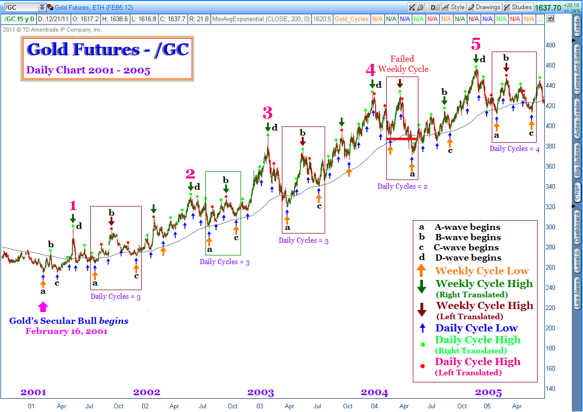
OK - let's get a chart up and see what all this really looks like. First we will begin with a look at the earliest years of gold's secular bull, 2001 - 2005.
The building blocks of gold's repetitive ABCD, the weekly cycles, are located by large upward pointing orange arrows under each weekly cycle low. I chose to place the abcd identifiers at the beginning of their respective wave. Indeed, C-waves conclude with a parabolic top, but d-waves also begin at a parabolic top, as well. In any event, I have sequentially numbered each C-wave event with a large hot pink numeral.
The downward pointing large arrows are either dark red (left translated weekly cycle) or dark green (right translated weekly cycle). The red and light green dots spot the precise location and translation of each daily cycle.
I have used a rectangular box to highlight the weekly cycle following each C-wave top. Remember my noting that there were 30 weekly cycles? Well, what I did not tell you was that of these, only 7 were left translated. AND, these 7/30 left translated weekly cycles ALL occurred in the weekly cycle following a C-wave top.
Does that sound random to you? It does not sound random to me. In fact it sounds rather predictable.
Before we move on to the second chart I would like to call your attention to the 2002 C-wave top that was followed by a right translated weekly cycle. That is a bit novel. And also notice that the early 2004 C-wave top was followed by a failed intermediate cycle. Truth be told, when a cycle that is left translated does not fail - that is bullish. The other rectangles on this chart all dodged the bullet and managed to bottom higher than their beginning.
This second chart shows gold futures price activity from 2005 - 2009. Note that the 5th C-wave parabolic is shown at the conclusion of the first chart and here at the beginning of this second chart. Please also note that the 2006 and 2008 C-wave parabolas were followed by weekly cycles that were left translated, and that the 2008 specimen, like the early 2004 example, was not only left translated but also a failed cycle.
Which brings us to this final third chart. C-wave top #7 (2008) appears on this chart, as it did in the previous chart.
What I find curious is our current situation, identified by the dark green rectangle. I have temporarily identified the bottom achieved last week as the conclusion of the weekly cycle following our recent C-wave top with the large orange upward pointing arrow. But here is the quandary - it is a right translated weekly cycle (dark green, not dark red). If the final daily cycle had persisted for another week or so, then the weekly cycle would have been dark red and left translated. But the recent sell off was so severe it apparently shortened the most recent daily cycle.
If you recall the first chart, the 2002 C-wave was followed by a right translated (dark green rectangle/arrow) weekly cycle. But that is the only time this has happened. Each and every other example following a C-wave top included a left translated (dark red rectangle/arrow) weekly cycle.
Is it possible our current weekly cycle really has not yet bottomed? And that the current daily cycle is going to not only be left translated, but also fail and trade lower than its $1562 beginning? For myself, if gold does trade below $1562 I will sell sell sell because without a doubt in mind we will be heading even lower. An even more bearish scenario would be for gold to trade a penny below $1535 as that would be the very definition of a failed weekly cycle. Our two previous examples of that (2004 and 2008) should be warning enough.
I'll be watching my four hour cycles software with a keen eye in the near future as I suspect it will tip me off should this situation begin to turn on my long positions. I'll keep you posted.
Good luck and when you figure out how this is going to turn out before I do, please let me know.
John
tsiTrader@gmail.com
I
t has been the 'week before school lets out for the holidays' that is always filled with more things to do than one can keep up with. But for the 30th year, I managed to survive.
I did finally do a trade, taking a hefty position in Direxion Gold Miners Bull 3X ETF (NUGT) at $20.25 on Thursday, and am just getting around to documenting it with this post.
This chart of NUGT was snapped somewhat near the conclusion of trading on Friday, the day following my purchase. The True Strength Index (TSI) indicator in the lower panel details the BUY signals I relied on for my trading decision. The green dot is a trend line break and the cyan colored arrow is a positive divergence. The blue arrow locates the four hour bar that was the cycle bottom.
Also, the scripts running in the price chart and on the TSI below have been tweaked to display properly with stocks and ETFs. My original scripts were designed to run on /GC - gold futures. Once I started putting GDX and other such 'stock market' ticker symbols on the screen a number of my dot trading signals and arrow cycle markers disappeared.
I figured out the problem - gold futures trade 24 hours per day and yield 6 four hour bars each day. Stocks do not trade 24 hours per day so the 2000 and 0000 (8 pm and midnight) four hour bars in the futures data do not appear in the stock data - because there is no data for these four hour bars. The fix was simple though tedious (as all this programming stuff seems to be). I rewired the programming to simply advance the dots and arrows from the four hour bar it first appears in the gold futures data to the next available bar in the stock data.
So now I have two scripts - one for futures and the other for stocks.
The random looking line in the TSI indicator panel (above) is a second TSI indicator set to a longer magnification. I think in this chart it is set to TSI (25,25), or something like that. This is just an experiment to see if/how useful it is to use a slower TSI for confirming reversals in trend direction . It seems to work pretty well.
The other feature I have included in my TSI indicators is the use of 4 colors. Readers who have visited my writing for some time know that the TSI gives us different information depending on the following four conditions: the TSI is rising above ZERO, the TSI is falling above ZERO, the TSI is falling below ZERO and the TSI is rising above ZERO. In this instance I am using blue, cyan, red and green, respectively.
Btw, all colors, dots and arrows are completely and easily customizable by the user - requiring no programming skills or hassles whatsoever. A click here and a click there and the colors, shapes and sizes of these items can be whatever you want.
Moving on, the next chart presents an overview of gold's past two weekly (intermediate) cycles. Assuming I have called this correctly, the final four hour cycle was quite short at just 28 bars. If I am incorrect and gold bottoms around bar 40 (as seems to be approximately its 'normal' cycle length) then early Monday trade beginning with the overnight Asian markets would be the expected time for that to occur. Curious perhaps, but most four hour cycles bottom at 0800 - just before the NYSE begins trade for the day. Hummmmm..........
The weekly cycles (yellow arrows) appear quite symmetrical and the current daily cycle calculation of 18.2 days seems reasonable within the context of past daily cycles.
And finally, let's take a closer look with the TSI indicator active below gold futures price.
If you look carefully you will notice that most four hour cycles (blue arrows) bottom and then are followed by the TSI yielding a trend line break BUY signal (green dot). This should prove to be a remarkably helpful confirmation that a cycle has indeed bottomed - particularly when these trend line break BUY signals occur very close to the expected bar count for the four hour cycle or roughly 40.
Shortly after 12/5 (Dec. 5) you will observe a positive divergence (cyan arrow) and trend line break (green dot) BUY signal in the TSI. I am aware there were many who took a long trade on GDX at this time. I did not because I was skeptical those signals were valid - they occurred way too soon to be near a four hour cycle bottom. And honestly, it would be impossible for a person to know this unless they had an eye on these four hour cycles.
(And if you are wondering, the plum colored dots are the trend line break SELL signals. The pink dots at the top spot the negative divergence SELL signals. The red dot signifies the nose bleed SELL signal when the TSI exceeds a reading of 0.80).
It turns out that GDX trade was indeed a dud. GDX never closed a penny higher after that day.....basically it was all down hill from there. Those who took the trade wisely retreated with as minimal a loss as possible.
Anyway, it looks like I am onto something very promising - for futures traders and stock traders of precious metal related securities. Let us all hope so.
My TSI Trading Record has been updated.
Like everyone else I am hoping to time the bottom of this vicious drop in the price of gold with a long trade - however short lived - in a miner ETF. Today was day 17 of a daily cycle that usually ranges from 20-28 days. Using the 'normal' daily cycle metric would suggest we are getting close to a bottom. And if the cycle is short this time, perhaps we are already there. Indeed, it is true that daily cycles that include precipitous falls are often shortened - explained perhaps by human nature's inability to stand pain as long as it tolerates incredible gains.

In any event, the current situation is a test of faith for me. That is, the four hour cycle is presently on bar 24 and the data suggests that this little cycle - painful as it is - should endure to bar 40 or thereabouts. If true, then gold has not bottomed just yet. It appears that Friday would be a reasonable time for gold to bottom - somewhere around bars 34 - 37 - shortened from the expected 40 bars due to the extreme decline we have had in price of late.
Anyway, I am going to try to buy on Friday. If I miss the bottom then shucks. And if I catch it about right then I will have a little more confidence in this four hour cycle. Stay tuned.
I have mostly completed my programming of gold's four hour cycle and can begin to show you what I have come up.
The blue arrows spot the four hour cycle lows and the bubble provides a count of the number of 4 hour bars for that cycle. The plum colored arrows are located below each daily cycle low with a calculation of its length measured in days. The orange arrow locates the weekly cycle troughs. Above price are green dots where a cycle high is reached in right translated fashion. Red dots locate cycle tops that are left translated.
This second screen shot is just a closer look at our current weekly cycle. You will notice that within the past couple of daily cycles (plum arrows) there were 3 four hour cycles (blue arrows) of approximately 40 bars each. And, currently we are experiencing the third four hour cycle of the current daily cycle. At this magnification it is easier to see which four hour cycles were left/right translated as identified by the red/green dots.
Needless to say, I was rather surprised at the relative symmetry of these four hour cycles and hope that it yields some excellent short term trading opportunities.
Finally, the third screen shot adds the True Strength Index (TSI) indicator below price in the indicator panel. The familiar blue arrows spot the four hour cycle lows and the plum arrow spots the most recent daily cycle low.
On the True Strength Index (TSI) indicator itself, the green dots locate the trend line break BUY signals. The plum dots locate the trend line break SELL signals. The cyan colored arrow points to the positive divergence BUY signals. The magenta dots along the top spot the negative divergences between the indicator and price above and red dots (not seen in this example) spot the nose bleed SELL signals where the TSI reaches a reading in excess of +.80.
Several mornings ago I awoke to see what gold was doing and was really disappointed to see it drifting higher and higher from $1740 to $1750 to $1750 and nearing $1760. The reason I was disappointed was that I knew gold was on about the 37th 4 hour bar and should be dropping into its cycle low around bar 40. I thought to myself - oh wow - I did all this work and the software doesn't work after all.
Then I get to school a couple hours later and take another peek.
I could NOT believe my eyes. There was a red candle dropping gold $60 and right on schedule. Are you kidding me?
I have been working on several projects involving writing script for use on the ThinkorSwim platform for weeks and weeks. Tonight I would like to post one of the projects that is completed.
This is a collage of 4 charts which very accurately identifies each of gold's daily and weekly cycles since the inception of it's secular bull market in February 2001. The small blue arrows point to each daily cycle low. The larger orange arrows identify the weekly (intermediate) cycle lows. Green dots identify the daily and weekly cycle highs that are within a right translated cycle, while red dots identify those within a left translated cycle.
In attempting to make sense of where we are at present, please note that each C-wave top throughout this secular bull has been followed by a weekly cycle that was left translated. I believe that we are presently in that type of situation, with the $1923.7 high achieved earlier this past fall as a C-wave top and the $1507 intraday low in latter September beginning our current weekly cycle.
If I am correct, the high achieved in early November will prove to mark the high of this left translated weekly cycle (ie. we will not see $1800 gold until well after this weekly cycle bottoms). My best guess is that the current weekly cycle will bottom sometime in February.
If, by chance, the September low is breached that would suggest we are in a continuing D-wave. Indeed, the early 2004 and 2008 C-waves were followed by left translated weekly cycles that "failed" to hold their Day 1 price level. But for now I am satisfied to entertain the notion that we are in a normal A/B-wave phase and that price will hold above the $1500 level into February.
Some other things I am writing the computer code for include the True Strength Index (TSI) indicator BUY/SELL signals of gold's secular bull market which will appear as an indicator directly below the price chart you see, and an adaptation of the script that allows for stocks/ETF's to be compared with gold's cycles and TSI BUY/SELL signals. One will be able to view a chart of, say, GDX or NUGT, and simultaneously have all of the cycles and TSI information of gold superimposed on that chart.
Another project I have nearly completed offers a precise analysis of the 4 hour cycles of gold. It turns out that each daily cycle of gold is made up of nested 4 hour cycles. These 4 hour cycles are usually around 40 bars (4 hour bars, of course). They are either left or right translated and provide some very interesting trading opportunities - not only for gold but also gold/mining related stock products such as GLD, GDX and so on. I look forward to beginning to trade this information soon and posting it for your observation and discussion.
Have a great week and I hope to get another post up within a week or so.


![[Most Recent Quotes from www.kitco.com]](http://www.kitconet.com/images/quotes_special.gif)


