Friday, December 31, 2010

Buy JAG - $7.15 -- US Dollar Update

*
Maybe not the ideal True Strength Index (TSI) indicator setup, but I was intrigued by the long term price downtrend line that Jaguar Mining Inc (JAG) appears poised to break through, so I made a purchase at $7.15.
*
Some other mining stocks with similar setups currently include: Anglogold Ashanti (AU), Cardero Resource Corp (CDY) see weekly chart, European Goldfields (EGFDF), Eldorado Gold Corporation (EGO), Pitchstone Exploration (PEXPF), Sunridge Gold Corp (SGCNF), Uranerz Energy Corp (URZ), and US Silver Corp (USSIF).
*
Click on the chart to ENLARGE
*
As far as the US Dollar is concerned, well, it still looks quite sick.  It has been clinging to the red support line I have drawn for the past hour - trying desperately to not fall below it.  If it does fall below it, it will mean that the dollar is now bearishly making lower lows on the daily chart and I would imagine the market will reward that event with a run for cover (and an even steeper drop in the dollar).  Stay tuned.
*
My TSI Trading record has been updated.


Buy BULM $1.15 and HWD $11.62

*
Early in yesterday's Thursday session I made a couple of purchases.  This first is seen on this daily chart of Bullion Monarch Mining (BULM) at $1.15.  The True Strength Index (TSI) and Money Flow Index (MFI) indicators appeared very favorably bullish with trend line breaks and a ZERO crossover of the TSI. I hoped that these factors, combined with the unusually small float of 38.5M, would result in a nice quick pop upwards. 
*
Unfortunately, quite the opposite occurred when the precious metal miners were taken by siege as a bought of profit taking swept though the sector in the later morning.  BULM closed the day down from my entry point at $1.10.  This is an excellent example of executing an ideal setup and yet it failed - at least for the first day. Did I forget to mention that NOTHING works all the time?
*
My other purchase yesterday is seen on this daily chart of Harry Winston Diamond Corp (HWD) at $11.62. My hunch is that the adjustment in price since the December 10th 6-K disappointed the market has been fully digested. It appears that buyers are returning, hopefully, to push price higher, as both the TSI and MFI are showing huge positive divergences from the otherwise flat price movement.
*
Click on either chart to ENLARGE
*
My TSI Trading record has been updated.
*
US Dollar update:  Overnight the US Dollar has continued to plummet and has sliced right through its 50 dma without so much as a hiccup.  The case for the precious metals bulls appears to be getting stronger with each passing day.

Wednesday, December 29, 2010

I Couldn't Believe My Eyes - US Dollar

*
Earlier today I wrote about the apparent freight train that the stock market has become.  Then this evening I was poking around, looking at this and that. Then I looked at the continuous contract for the US Dollar.
*
I could NOT believe my eyes.
*
Instantly I thought to myself, 'wow - look at that!  That is incredible!!'  
*
In a flash I then understood - for myself - why gold and silver had been rising so sharply this week, and why the stock market had turned into this irrational freight train loaded with too many bulls to the ceilings.
*
The US Dollar is really going to dive ...... take a look at the chart.
*
The True Strength Index (TSI) indicator has not only convincingly made a bearish ZERO crossover, but the rising trend line from the last 3 months has been obliterated.
*
Click on the chart to ENLARGE
*
If this development continues, as I strongly suspect it will, the implications are rather enormous for the immediate months.  Primarily, we will get the parabolic rise that so often climaxes gold C waves, silver will continue higher, much higher.  PAL (Palladium mining stock) will go to the sun, as I wrote in an article recently. The stock market will also continue to drift higher as money flees cash and tries to find a place to hide. But eventually the bear  stock market will turn on itself as companies find it increasingly difficult to make a profit with inflating commodity and energy prices. And the best place for appreciation going forward, the only sector in a true secular bull market, will be the precious metals complex (in my opinion).
*
Well, I guess Ben's adding $12 Billion a day to the supply of cash is finally taking a hold of our currency.  You can't get something for nothing.  You can't print money out of thin air and still pretend to be affluent.  It can only work like that for so long and then the piper has to be payed.  Solving a credit card problem with a credit card is no solution - unless you think like Ben.  As the US Dollar declines, cash will not be king.  Instead, it will be gold, silver, platinum and palladium.  Enjoy the ride, because it looks like it is on the way!

The S+P Freight Train

*
I know, I know.  Never stand in front of a freight train.  You're right.  And being short two S&P 500 contracts is, well, wrong! This first chart is the SP-500 daily.
*
By the way, the sentiment data from Investor's Intelligence is just in and it shows that the bullish % has backed off a couple % to 55.6%.  All in all, I continue to believe the stock market is in for a dousy of a correction, but probably not until the True Strength Index (TSI) indicator says it's time.  Money Flow is trying to stage a comeback and we'll see how long that lasts.
*
Click on any chart to ENLARGE
*
Another look at the freight train, this time from the vantage point of the /ES continuous SP-500 contract.  I think it is completely fair to say that I entirely miscalculated my timing on taking a short position.  Oh boy, and it is costing me, too.  LOL  Anyway, there appears to be enough momentum in progress that barring some engineer screaming on the brakes, this thing could float along, drifting higher for a couple weeks.  Darn it.
*
And finally, this is a 60 minute chart of the SPDRs S&P 500 Trust Series ETF (SPY).  Thinking optimistically, as the Money Flow Index (MFI) indicator has already begun to roll over, and the True Strength Index (TSI) indicator is on an impossibly steep trajectory, I am thinking later today we may see some breakdown in price and that just might be my opportunity to step off the train track.
*
Oh, before I forget.  I did buy some shares of Market Vectors Junior Gold Miners ETF (GDXJ) at $40.01.  I think this is the first time I have bought this ETF - surprising, huh?
*
My TSI Trading record has been updated.

RSI Momentum and Money Flow for Gold and Silver

*
If you have spent any time on my website you have probably noticed I am something of a nut about drawing trend lines on indicators.  This little fascination of mine began several years ago and well, I guess it still fascinates me.  I'm hopeless, huh?
*
Anyway, I decided to poke around with the RSI momentum indicator on a chart of gold and silver, and see what it would tell me.  To no big surprise, my drawn trend line breaks on the indicator did a rather impressive job of telling me when price would go into a corrective mode.  
*
This first chart is that of daily $GOLD from www.stockcharts.com.  Of course this musing is rather useless unless it can tell you something about the future, which I think it has. Take a look at the chart and see what you think.
*
Click on the chart to ENLARGE
*
This second chart is that of daily $SILVER.  Now I will be the first to tell you that these charts are more art than science, but it always amazes me that there still seems to be something worthwhile about the exercise.  In this case, it appears there is reason to believe silver could very well have months ahead of it to continue higher.  With the parabolic rise it has had so far, that seems a bit silly - but there it is on the chart for your consideration.
*
Finally, I was curious to explore the idea that sustained and continued Money Flow would be needed to propel gold higher if indeed, it is going to continue higher at this time.  So I made this chart to get a feel for how the Money Flow Index has behaved in relation to the price of gold for the past many months, and see if it would give me some clues about where gold is headed at the present time.  
*
What I found out was about as bullish a setup as I could have dreamed up.  Even better, I did not dream up a thing!  There it is for you to consider.  If I'm not mistaken, the TSI has just issued a BUY signal, money flow has been ramping up for a couple months while price has essentially consolidated while yet making higher highs and higher lows, and by golly, we just might be on our way to higher prices!

Tuesday, December 28, 2010

Buys: CDE $27.25, KGN $9.03 and NXG $3.15

*
I was encouraged by the strong performance of the precious metal complex today and hope it bodes well for the next few weeks, at least. So I did a little shopping before the market closed and made three purchases.
*
The first purchase of Coeur D'alene Mines Corp (CDE) at $27.25 felt kinda odd to me.  I can still remember buying and flipping this stock a couple years ago for around $1.  Now granted, they have have a reverse stock split since then, but to buy CDE today for 27 times the price of my memory was kinda weird.  Anyway, if silver is going to go to the races now, and that is an 'if', I think I need to own a silver miner - like CDE.
*
Click on any chart to ENLARGE
*
My second purchase was of Keegan Resources Inc (KGN) at $9.03.  The True Strength Index (TSI) indicator setup looked good and I was also pleased to buy something that did not appear to have any overhead resistance.


*
My third and final purchase today was of Northgate Minerals Corp (NXG) at $3.15.  I like to own some stocks that I regard as having extra value.  A couple years ago I could buy a mining stock selling at .2X Book Value.  Even within the last year it was not too difficult to find one selling for well under 1X Book Value.  But times have changed - so with NXG selling at 1.6X Book Value, this is in the range of the best 'value' available in the stock market today, using the Book Value metric, anyway.
*
My TSI Trading record has been updated.

Bought and Sold ANO, Sold ZSL

*
I decided to try my hand at a day trade, as there is no school for me to teach this week (thank heavens).  I bought Anooraq Resources Corp (ANO) at $1.45 in the premarket.  I noticed that platinum had had quite a strong advance overnight and that this development did not seem to be reflected in the price of this stock.  Lucky guess, as it resulted in a quick 6.9% day trade gain.
*
Click on any chart to ENLARGE
*


*
I have been waiting to see when gold and silver would show me their hand.  I have been thinking they were coming in for a landing and then perhaps a brief correction.  And that is still a possibility I suppose.  But the powerful move we are seeing today with the entire precious metals complex has me thinking it is well past time to remove this Proshares UltraSilver ETF (ZSL) hedge from my portfolio, take the loss, and see if my mining positions will now resume their advance.
*
Finally, this is a chart of the E Mini S+P 500 continuous contract just a few minutes ago.  I guess the question for the moment is whether this little pennant/triangle on the 15 minute chart is going to break downward as a continuation pattern, or if it finally resolves to the upside.  The  underlying True Strength Index (TSI) indicator has formed a promising positive divergence.  But call me skeptical as I believe strongly that this market, sooner or later, is going to have one heck of a big correction.
*
My TSI Trading record has been updated.

Sunday, December 26, 2010

6 Buy/Sell Techniques using the True Strength Index (TSI) Indicator


*
I have identified no fewer than 6 techniques for using the True Strength Index (TSI) indicator for the accurate generation of Buy/Sell trading decisions.
*
I will present these 6 techniques accompanied by charts and demonstrate their interpretation.
*  
The 6 techniques are:
*
1. ZERO Crossover
2. Trend Line Break
3. Positive/Negative Divergence
4. Support/Resistance Line Break
5. Nosebleed/Opposite
6. Moving Average Crossover
*
Let's first begin with the ZERO Crossover, as it demonstrates the wonderfully characteristic 'truth' of the True Strength Index indicator:
 
a.) when the indicator is rising above the ZERO level, price is always also rising.  
b.) when the indicator is falling below the ZERO level, price is always also falling.
*
*
This daily chart of the SPY ETF demonstrates the concept that when the TSI indicator is rising above the ZERO level, price is always rising.
*
Click on any chart to ENLARGE


*
This daily chart of the SDS ETF demonstrates the concept that when the TSI indicator is falling below the ZERO level, price is always falling.


*
The 2nd technique is called the Trend Line Break.  A Buy signal is generated when a series of descending peaks are connected and the resulting trend line finally runs into an indicator reading that begins to exceed the downward trajectory of the line. This 4 hour chart of the DZZ ETN yields a couple of Buy signal examples using the Trend Line Break technique.
*
The Trend Line Break technique issues a Sell signal when a series of ascending troughs are finally met by an indicator reading that begins to  fall below the resulting trend line.  This 4 hour chart of the GLD ETF yields a couple of Sell signal examples using the Trend Line Break technique.


*
The 3rd technique is the Positive and Negative Divergence technique. 
*
In the case of a positive divergence, price either holds sideways or makes a lower low, while the True Strength Index indicator simultaneously makes a higher low.  What is going on here is that momentum (TSI) is improving while price seems to be going nowhere.  This disagreement or divergence in direction is positive for the ongoing direction of price.  This 60 minute chart uses the GLD ETF to demonstrate a rising TSI that is diverging in a favorable or positive manner from price.
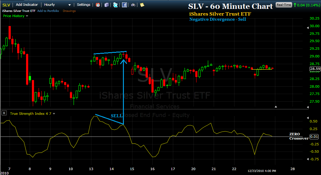
*
negative divergence Sell signal occurs when price trades sideways or even makes a slightly higher high, while momentum (TSI) concurrently makes a lower high.  In this case, price appears to be either stable or improving, while the TSI, making a lower high, tells us that momentum is becoming exhausted.  The difference in direction, the divergence, therefore portends a negative outcome for price. This 60 minute chart of the SLV ETF shows us how price usually resolves after a negative divergence setup.

*
The 4th technique for generating Buy/Sell signals using the True Strength Index (TSI) indicator involves the careful observation of the indicator's horizontal lines of support and resistance.  
*
This daily chart of the GLD ETF illustrates the Sell signal generated when the horizontal support of the TSI is broken to the downside.
*
This daily chart of the SPY ETF gives us 4 Buy signs when the resistance level of previous high readings of the indicator are surpassed.


*
The 5th technique is what I call 'Nose Bleed' and 'its opposite'.  There are times when the TSI screams higher to reach a level comparatively out of context with the recent past.  Also, it happens in the 'opposite' manner where the TSI reaches low levels that are, contrasted with recent behavior, simply off the standard deviation chart.  These situations, where the TSI movement exceeds the 'norm' themselves generate Buy and Sell signals.

*
This daily chart of the SPY ETF yields an example of the nosebleed Sell signal and 'its opposite' - the excessively low reading that generates a Buy signal.


*
Finally, the 6th technique involves the use of a moving average on the TSI indicator. The crossovers of the indicator with the moving average create the Buy and Sell signals.  
*
This 4 hour chart of the UUP ETF arbitrarily uses a 9 period moving average to generate the Buy and Sell signals identified.
*
While I have identified no fewer than 6 separate techniques for using the True Strength Index (TSI) indicator, I find that the the trades with the highest probability for success will combine two, three and sometimes even 4 techniques.  An example of this would include a Buy signal occurring just above the ZERO crossover as a result of a trend line break with a positive divergence in the previous bars.  
*
Probabilities for a successful trade are also raised when additional indicators are combined with the TSI to provide confirmation of likely change in price direction.  The indicators I often combine with the True Strength Index for this purpose include the Money Flow Index, Demand Index, and the Volume Flow Indicator.  My idea here is to use other indicators that measure something a bit different from momentum, such as those that calculate volume, volatility or some metric other than momentum.
*
The True Strength Index (TSI) indicator is freely available via the Internet based charting software at FreeStockCharts.  
*
I am open to answering questions and providing assistance to anyone interested in becoming more proficient at using the True Strength Index (TSI) indicator.  Just write me an email with your questions, OK?
*
John

Thursday, December 23, 2010

The Demand Index and The Light Switch

*
Today's market action gives me an opportunity to follow up on the post I did earlier this morning about the Demand Index.  This 30 minute chart of the SP-500 futures was snapped just a few minutes ago and uses a True  Strength Index magnification of (25,13) and a Demand Index setting of (13).
*
This chart should give you an idea of the power and potential usefulness of the Demand Index.....  
*
Light switch on (positive indicator reading means buying pressure exceeds selling pressure - price goes up).
Light switch off (negative indicator reading means selling pressure exceeds buying pressure - price goes down).
*
Pretty kewl.  (And kinda like cheating, but don't tell anyone).
*
Click on the chart to ENLARGE

The Demand Index & The Prospects for Gold/Silver

*
Today I would like to introduce you to an indicator I have not written about before.  It is called the Demand Index and was invented by James Sibbet.  As with the True Strength Index (TSI) indicator, I have used the Demand Index indicator for about the past 4 years.  Interestingly, its interpretation is very similar to that of the TSI.  When the indicator reads above ZERO, buying pressure is greater than selling pressure, and the opposite when below ZERO.  It does lend itself well to the consideration of trend line breaks and both positive and negative divergences.
*
Anyway, the Demand Index is a very sophisticated indicator that incorporates price and volume to give a ratio of buying and selling pressure.  In this respect it is similar to the Money Flow Index (MFI) indicator that I have frequently demonstrated in past posts.  The only free software that includes the Demand Index, that I am aware of anyway, can be found at www.ThinkorSwim.com
*
This first 4 hour chart is of the continuous Gold contract and the indicators below price are the TSI set to (25,13) and the Demand Index set to (13).  What I find note worthy is that since the high reached December 7th, both momentum (TSI) and buying pressure (Demand Index) have persisted with readings below ZERO.  This suggests to me that a trend is setting in and the trend is not favorable at this time for upward price movement.
*
Click on the chart to ENLARGE
*
This second 4 hour chart is of the continuous Silver contract with the same two indicators positioned below price.  Though Silver has definitely been a stronger performer than Gold this fall, the Demand Index in particular suggests strongly to me that price could begin to fall apart at any time.  It appears that while price has continued to trade sideways, buying pressure has been anemic.  If I were to put the accumulation/distribution indicator on the chart I would expect to see a significant degree of distribution.  Essentially, the smart money has been unloading to the new money at this price level - and my guess it is only a matter of time before price begins a trip in the southward direction.
*
Though it does not show up on my TSI Trading record, I have sold a futures contract on the SP-500 (shorting the stock market). Also, I will continue to hold my ZSL position (short silver).
*
And finally, the weekly sentiment data published by Investor's Intelligence came out yesterday.  It revealed that the percentage of investment advisers bullish increased from last week's reading of 56.8% to 58.8%.  The post I wrote SP-500: Look Out Below is more true this week than last week when it was written. The 'other shoe' has not dropped yet, but rest assured, it will.

Wednesday, December 22, 2010

Current Sentiment Data re: Stocks and Gold

*
One of my favorite contrary indicators is the put to call volume ratio of an individual stock security.  Generally, a relatively high put to call ratio indicates that market participants are, on balance, very afraid of a price drop.  A relatively low put to call ratio means that market participants are overwhelmingly convinced that price is going much higher.
*
And the way to use this data is to look for extremes in these sentiment readings and know that they are contrary indicators.  That is, when the preponderance of market participants are in strong agreement about market direction, they are about to get the surprise of their lives.  LOL
*
  
The SPY ETF will serve as our 'sentiment assessment' surrogate for the SP-500.  What we note from today's data is that the put to call ratio is literally lower than any day in the past 12 months.  This means that market participants are more 'certain' that the stock market will continue higher than any other day in the past year.
*
Click on the charts to ENLARGE
*
The GLD ETF will serve as out 'sentiment assessment' surrogate for the precious metal Gold
*
This is a curious situation as the price of Gold has literally gone nowhere in the past 9 weeks.  Yet 9 weeks ago, investor sentiment was extremely bearish with a sky high put to call ratio of 1.30.  
*
Today we see that sentiment has completely reversed extremities.  Now it is extremely bullish as represented by a low put to call ratio of .80.  Yet the price is virtually the same - $135.
*
As a contrary indicator, this GLD data, as with SPY, strongly suggests that a correction of significance is coming to both the stock market and Gold - and soon.

Monday, December 20, 2010

Explosive Miners with 2011E Earnings Projections

*
One of the things that has continually amazed me is how undervalued stocks will eventually become very strong movers, if not downright rockets.  I cannot begin to tell you how many stocks I have come across that were selling so cheaply I could not believe it.  And invariably I would just pass, thinking there must be something wrong with the stock. After all, how could I, of all people, see something so obvious that the entire market was missing?  Impossible, I would muse.
*
Months later I would come across the same stock and my eyes would widen in utter disbelief - amazement.  Price had virtually exploded and I missed the whole thing.  Incredible.  How could a guy be so right and so wrong at the same time?  If you've been at this stock market stuff a while, I'm sure you know what I am talking about.
*
Well anyway, I decided to revisit this subject of exploring for potentially undervalued mining stocks today and share with you some of my findings.  I compiled the chart below from data provided by Bill Matlack and recently published by Kitco.  The links to this data are at the bottom of the chart.
*
I selected 19 stocks based on my impression of how explosive their 2011 estimated earnings are likely to be in comparison to this year's 2010 earnings.  Some of these estimates are simply mind blowing and I have dedicated a little folder in my FreeStockCharts portfolio to keep an eye on these stocks for True Strength Index (TSI) indicator buy and sell signals.  Perhaps you would like to keep an eye on some of these stocks as well?
*

STOCKS WITH EXPLOSIVE
POTENTIAL
ESTIMATED EARNINGS
Metal
Price
2010E
2011E
2012E
1.
ANO
Anooraq Resources Corp
(.08)
.03
.07
Platinum
$1.34
2.
AZK
Aurizon Mines Ltd
.12
.43
_
Gold
$7.24
3.
BRD
Brigus Gold Corp Ord
(.01)
.23
_
Gold
$1.88
4.
CDE
Cour D’alene Mines Corp
.13
1.68
_
Silver
$26.41
5.
COLUF
Colossus Minerals
(.06)
.66
_
Gold
$8.58
6.
CPPMF
Copper Mountain Mining
(.03)
.39
_
Copper, Gold
$5.80
7.
CROCF
Crocodile Gold Corp
.04
.13
_
Gold
$1.44
8.
DMMIF
Dynasty Metal & Mining
.09
.84
_
Gold
$4.18
9.
GBG
Great Basin Gold
(.03)
.19
_
Gold
$2.93
10.
GSS
Golden Star Resources
.06
.34
_
Gold
$4.57
11.
HMY
Harmony Gold Mining Co
.02
.92
_
Gold
$12.41
12.
LSGGF
Lake Shore Gold Corp
(.01)
.19
_
Gold
$4.08
13.
MLKKF
Mercator Minerals
.03
.44
.61
Copper/Moly
$3.61
14.
ORVMF
Orvana Minerals Corp
.11
.65
.75
Gold/Copper
3.60
15.
OSKFF
Osisko Mining Corp
(.05)
.65
_
Gold
$14.49
16.
SGRCF
San Gold Corp
(.04)
.15
_
Gold
$3.79
17.
SMNPF
Scorpio Mining Corp
.00
.03
.17
Silver, Zinc
$0.99
18.
UEC
Uranium Energy Corp
(.25)
.22
.59
Uranium
$5.54
19.
USU
Usec Inc
.01
.50
_
Uranium
$5.74
For additional details/research, visit: